Illustrious contrast adjuster - Illustrious-v0.1(final)
Related Keywords & Tags
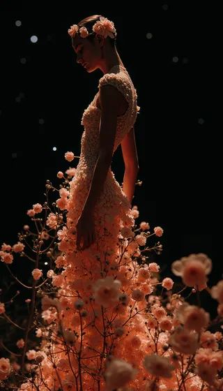
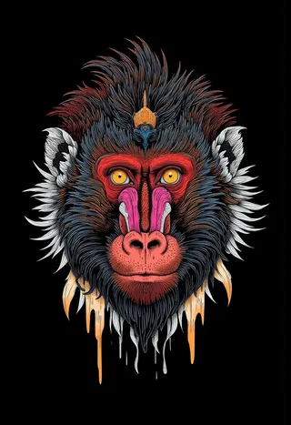
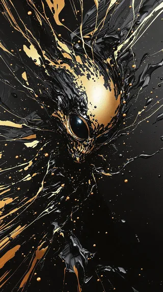
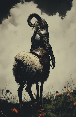
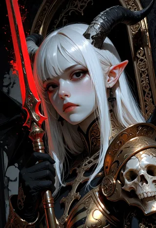
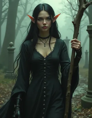
Highlighted images
Recommended Negative Prompts
worst quality, comic, multiple views, bad quality, low quality, lowres, displeasing, very displeasing, bad anatomy, bad hands, scan artifacts, monochrome, greyscale, twitter username, jpeg artifacts, 2koma, 4koma, guro, extra digits, fewer digits, jaggy lines, unclear, artist name, watermark, logo
Recommended Parameters
samplers
steps
cfg
Tips
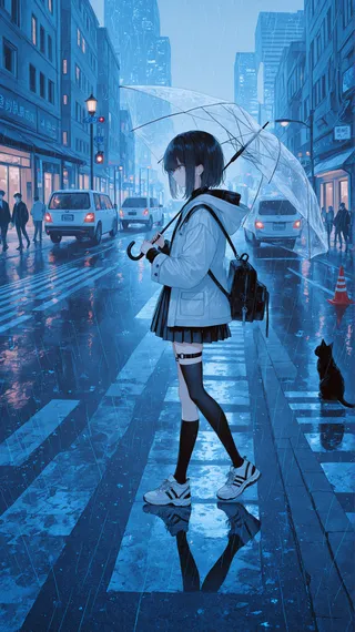
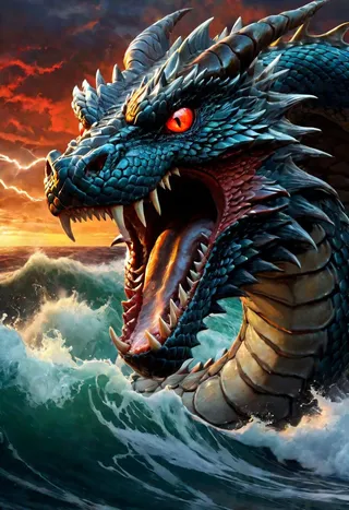
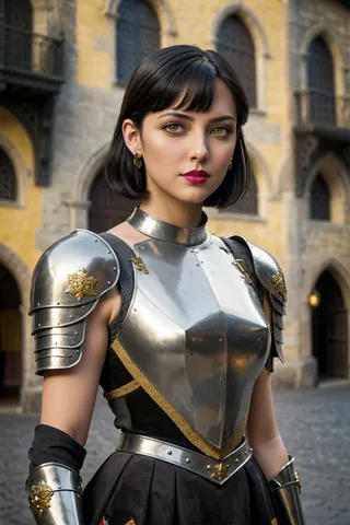
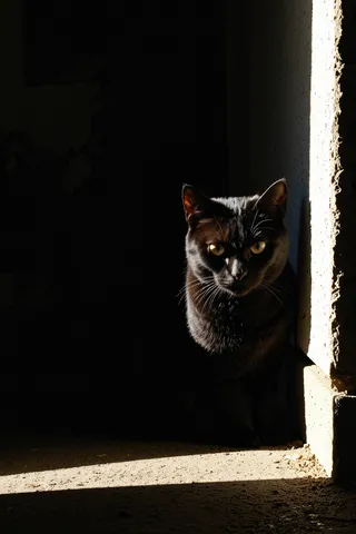
It is recommended to keep the LoRA weights between -2 and +2 to adjust image contrast effectively.
Positive or negative weights can be used to achieve different contrast effects.
The model may produce unexpected elements in complex or monotonous scenes.
Version Highlights
from Illustrious-XL-0.1 Strength:-2~2
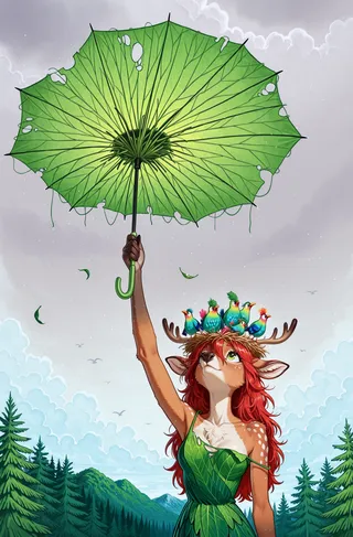
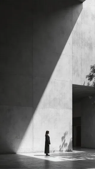
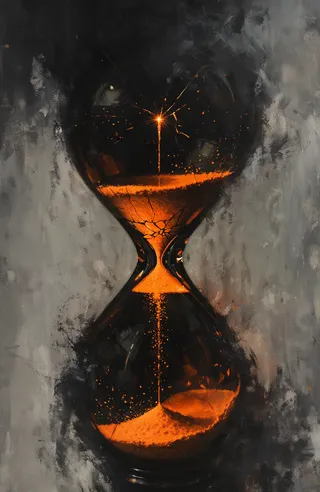
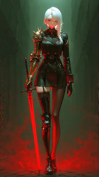
this LORA on the Illustrious-XLv0.1 training standard, it is recommended to keep the weights between -2 and +2 (usually). As shown in the figure, the function of this LoRA is to deepen/lighten the contrast in the image. Different effects can be achieved by using positive or negative weights.
For different versions, please read About this version .
After testing, I discovered some weird features (?), for models trained on the Illustrious-XLv0.1, their stability and performance are much better. but for the Illustrious-XLv0.1 model itself, its stability is slightly worse... I started having some doubts about my work, but I still uploaded it.
Warning:
In some complex scenes or scenes with monotonous tones, this model may produce elements that differ significantly from the original image.
Contributor

Model Details
Model type
Base model
Model version
Model hash
Creator
Discussion
Please log in to leave a comment.
Model Collection - Illustrious contrast adjuster
Images by Illustrious contrast adjuster - Illustrious-v0.1(final)
contrast Images
lora Images


tool Images
